|
|
Post by mrgrotey on Jan 24, 2010 11:18:56 GMT 1
however I want to keep them in two clearly defined groups as much as I can, Oh I wasnt commenting on their overall position on the ship. All I mean is that they are not very well spaced apart, their gaps between themselves are rather erractic and should be looked at. heres what I mean content.screencast.com/users/mrgrotey/folders/Jing/media/f0437e08-395e-4b1f-ade9-fb1e558e4235/2010-01-24_1016.pngGet the spaces more even and it will come accross as a better design, at the moment they look, as I said, and if they were just dumped there and not positioned carefully. Some also look like they would collide with eachother should they rotate |
|
|
|
Post by Lonesome Crow on Jan 24, 2010 16:00:28 GMT 1
Another point I noticed a while back was the placement of the two big guns forward of the superstructure, they are massively slightly too far over to the right, below is your image 'front' with a red dotted line to show the centre of the bow, it doesn't line up with the funnels but that's only a little bit off, but the guns with green dotted lines around them are way off.  You may have corrected this already, I don't know, if you have ignore this post.  |
|
|
|
Post by Commandingtripod on Jan 25, 2010 3:35:25 GMT 1
Not a worry, I understood what you meant Mr G, and I revised the layout so it looks better: 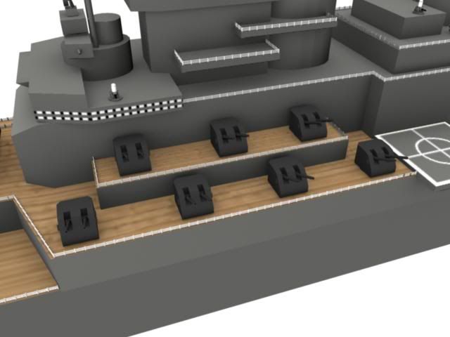 The guns have been spaced out in a more even and logical manner. And LC, you were right that was a problem, and honestly I have no idea how it happened in the first place. That said, I since corrected it after I posted those images originally, it looked like one side of the hull ended up slightly wider than the other for some reason, but I can't think of when that might have happened because these ships have been changed for many years now. However that's been corrected.  |
|
|
|
Post by Relyt on Jan 25, 2010 20:15:12 GMT 1
I see you've added Phalanx CIWS 20mm gatling guns. If I'm right, and I always am, those are designed to shoot down incoming missiles at close range. They have now been replaced with a dedicated short-range missile system to track and destroy enemy missiles.
|
|
|
|
Post by Commandingtripod on Jan 28, 2010 11:56:54 GMT 1
Here's a new image of the battleship: 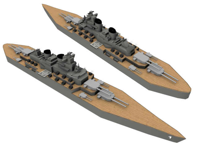 As you can see, I've re-textured the deck which makes it look better from this distance. I won't lie though, I need work on it some more for close up shots, particularly getting the seams and all matched up. Also, I redid the funnels, I'm not sure that you can tell from the above angle though. Finally, the gun spacing becomes more evident. While there's still more things I could do, I've decided to pause this project for a while. Compared with what it once was, it looks good, still in perfect animation condition to, so I'm pushing on with my other ships, and I'll post here when the next one is done. |
|
|
|
Post by mrgrotey on Jan 28, 2010 14:31:08 GMT 1
Tons better mate  |
|
|
|
Post by Lonesome Crow on Jan 29, 2010 2:50:09 GMT 1
Looking very good now, the funnels are so much better.  |
|
|
|
Post by Commandingtripod on Feb 4, 2010 14:00:09 GMT 1
More pictures time.  Only two this time around. 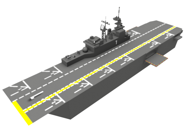 This is the amphibious assault ship, based on the USS Wasp. A problem at the moment is that the white on the deck is 'bleeding'. You can see it's kinda blurry so I need to find a way to fix that. This is the as of yet, unfinished Destroyer. 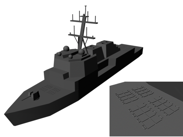 Originally the thing was going to be an all gun ship, however when I went to modernize it I decided against that plan, and instead opted to base it on the USS Arleigh Burke class. I will say so now, I stuffed the vertical launches, as they should be slightly raised, but I think I have a way around it. On a separate note, I tried to render an image with water, the battleship and the LHD, however my computer decided it would crash rather than do it.  So once I've done the destroyer I can start to put something together. |
|
|
|
Post by Lonesome Crow on Feb 6, 2010 3:41:26 GMT 1
Is the white bleeding because you are working at too low a resolution? just an idea, mrgrotey could probably give a better explanation.
|
|
|
|
Post by Commandingtripod on Feb 6, 2010 6:22:39 GMT 1
Is the white bleeding because you are working at too low a resolution? just an idea, mrgrotey could probably give a better explanation. I think you're right, so I ran some render tests. I tried with three different sized options, 640x480, Full Screen 1024 and HD 1080. I found that 'close in' shots shall we say aren't affected too much, however further out the differences show up. 640x480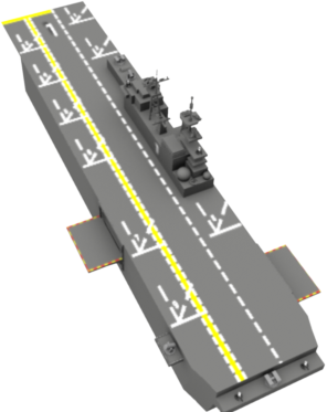 Full 1024 Full 1024 HD 1080 HD 1080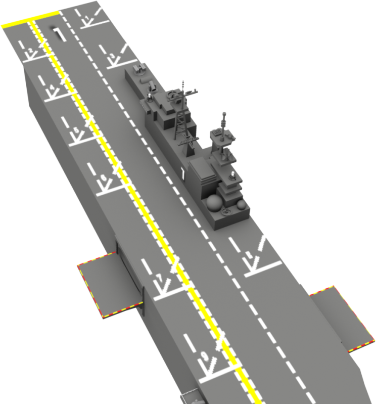 The difference shows up well, so for 'final' shots I'll be rendering it out in 1080. And I re-rendered my battleship to, to see how it would look. 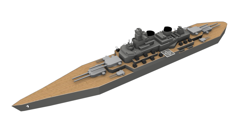 |
|
|
|
Post by Lonesome Crow on Feb 7, 2010 2:06:41 GMT 1
I think I can see what your problem is, you have used 'Drop Shadow' behind the big figure '1' on the deck, have you also used 'Drop Shadow' behind the lines and parking numbers? but instead of using black shadow you've used white, this is making the white numbers and lines look fuzzy. I would also say your dotted white lines look much too wide, see below.   |
|
|
|
Post by Lonesome Crow on Feb 7, 2010 3:35:50 GMT 1
This is what I mean, I have repainted your deck. On the first image the numbers are just as crisp and sharp as you would like, on the second image I have added some Drop Shadow to the numbers and you can see they are fuzzy. Also note the size of the dotted lines compared to your original. Even now I would say my numbers look too big.   |
|
|
|
Post by Commandingtripod on Feb 7, 2010 5:51:34 GMT 1
 What program did you use to do that? You're right though, that's what I'm after, also, I've used no drop shadow on the landing section numbers, the edges are set to hard but I still can't get them to work well. I'm currently using Macromedia Fireworks for the texturing stuff, however I think I might need to upgrade to another program soon. |
|
|
|
Post by mrgrotey on Feb 7, 2010 10:55:00 GMT 1
He uses Paint Shop Pro I believe.
and yerah I agree, the numbers are still far too big. You dont need to make everything big enough to read/see just to make a point of letting people know you've put it there, its the small, almost unnoticeable details that add so much to realism.
Take the post from Crow there, in the second photo the carrier is much bigger in size compared to the render he cleaned up yet the number in the photo are barely recognisable as number at all they are that small, whereas in the smaller render you can see then very clearly they are that big.
I would seem that crow has improved your yellow colour too, you had it too lemony, it has a warmer hue to it than that.
|
|
|
|
Post by Lonesome Crow on Feb 7, 2010 18:09:12 GMT 1
Why have you used drop shadow on the number 1 at the end of the flight-deck? It looks wrong, it looks as though the 1 is floating a couple of feet off the deck, I would get rid of it. Also, looking at the photos of the carrier I see the dotted line running down the centre of the deck should be in the centre, both yours and mine are over the the starboard side too much. Edit: Mr G is right, I do use Paint Shop Pro, it's only a 2D program.  |
|