|
|
Post by bayne on Jun 9, 2007 16:25:11 GMT 1
[glow=red,2,300]Lovely stuff!
Personally I think the rust looked perfect.. for an abondoned war relic.. some ivy growing up one leg, birds nesting in the eyes, a couple picnicing under the machine with the stars just starting to come out through the smog... and a green streak in the sky.
MU-HAHahaaaaaaaa
[/glow]
|
|
|
|
Post by mrgrotey on Jun 10, 2007 15:05:51 GMT 1
richardburton: thanks! CT: cheers, yeah i used this as a kind of trial run for the bigger project so could get i dea of how hard it will be, David Faltskog: cheers man poyks: cheers mate, i was quite pleased with how it went  the donal: ?....have you changed your name? recognise the avatar but the name doesnt ring a bell...hmm.. ah well. thanks for the comments, and read a bit further on for a small update  sorry for the delay haha krakatoa: thanks, cheers!bayne: thanks! nice ideas there. ------------------------------ heres what I got up to recently just before my week in sunny devon last week. not too much, added the final touches to the the texturing on the tripod, posed him, and worked on the heat ray then added some moddy lighting Can you let me know what you think about which of the two you prefer as they have different heat rays (the second is more firey and im not sure if i went a bit over the top with the effect) click on the thumbnails... 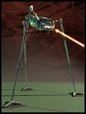 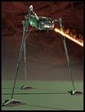 Comments and crits very welcome |
|
|
|
Post by Scifishocks on Jun 10, 2007 15:35:07 GMT 1
Yeah, I like the less fiery one best.
|
|
|
|
Post by Anim8tr on Jun 10, 2007 23:23:43 GMT 1
That is indeed one beaut of a model! Excellent refinement on the battle scars and weathering. And the green lighting adds a very nice touch. You've some truely amazing talent!
Definitely the first heat ray. Looks much more focused and intense IMO.
Awesome work as always! A number of your modeled soldiers and cannons to those scenes would look killer!
|
|
|
|
Post by Commandingtripod on Jun 11, 2007 8:49:38 GMT 1
Wicked.  First heat ray for me.  Nice stuff.  |
|
|
|
Post by richardburton on Jun 11, 2007 9:41:31 GMT 1
Both excellent but I agree with the others and think the first one just has the edge.
|
|
|
|
Post by steann on Jun 12, 2007 23:17:00 GMT 1
yep the first one and well done  |
|
|
|
Post by spaceintruder on Jun 14, 2007 1:51:45 GMT 1
Fantastic Work.
|
|
|
|
Post by richardburton on Jun 14, 2007 9:20:15 GMT 1
Welcome to the board, Spaceintruder.
|
|
|
|
Post by mrgrotey on Jun 16, 2007 18:30:47 GMT 1
nerfy: okey dokey  anim8tr: wow thanks for the kind words! everyone seems to be saying the first one so i think ill go with that one CT: cheers for the vote man. richardburton: fair enough, the first one it is  steann: thanks! spaceintruder: thanks a lot  -------------------------------------------- Update: after scrapping my first scene attempt as it was truly awful and was going nowhere, iv come up woth this WIP. Can you let me know what you think, what to add, what to remove, .etc.etc, im quite liking it but would rather be notified of something before going to the end and not being able to change it without laods of work. obviously loads of the models are are temporary objects but im getting the composition done first. 328kb 1200x749px 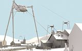 Ive been modelling/texturing like mad recently to make lots of filler objects, heres a comp of them all so far 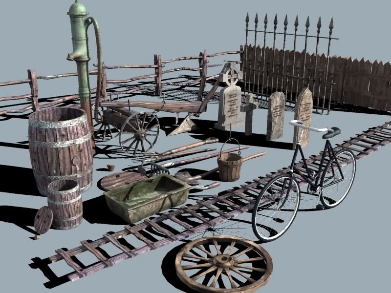 and the church you can see in the background 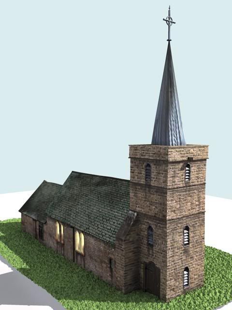 cheers for any comment once again guys and gals |
|
|
|
Post by Scifishocks on Jun 16, 2007 23:14:29 GMT 1
Again, amazing stuff. It's brilliant to see all the elements being posted before they come together.... and I think when they do come together, it will be pretty amazing. Looking forward to it!  |
|
|
|
Post by thedonal on Jun 19, 2007 18:37:00 GMT 1
Grotey- yer a talented chap and no mistakin'!
More great work and I'm really REALLY looking forward to seeing the finished scene. Will it move? That'd be lovelier!
How about getting the 'eyes' to glow a little- would perhaps give them a bit of life and add to the sinister effect.
I've got a stunning idea for an animated scene of walking tripods if you're keen, too. It's an image I've had since a child and don't posess the skills to realise it myself...
|
|
|
|
Post by Stu on Jun 19, 2007 22:16:38 GMT 1
'kin' 'ell!!!!
Thats amazing!!!!
|
|
|
|
Post by Commandingtripod on Jun 20, 2007 8:31:51 GMT 1
That's fantastic! ;D I'm really starting to run short of things to say.  |
|
GoA
Newbie!
 WoTW fan. :)
Posts: 22
|
Post by GoA on Jun 30, 2007 3:31:03 GMT 1
I think most of these people have pretty much summed up what i'm gonna say, but i'll say it anyway. This. Work. Is. EXCELLENT!!! Seriously, it's GREAT!! I'm loving the Tripods, especially the first few pics. Are you a proffesional 3d artist perchance?  Looking at your tripod(s), i can tell mine needs some more work done before I even begin to think about texturing. I've got quite a few questions,  for instance... The body; how did you start modeling that? What object did you start with? Cylinder, Cube or lathed spline? The one i'm working on, the body seems too thin hightwise, or maybe it's cause the legs are too think...but then, I am using pretty low-res ref pics that are pretty blurry.... The detail of the hood, those curves that go round the eyes, how'd you pull that off? because that's one snag i've run into with my model. And my final question...the legs...are the upperleg jionts ball&socket or hinge? that's one thing i can never figure...and the suport struts, are they meant to be hinged or telescopic? I'm asking the last one for animation reasons.  I'm using 3DS Max 8 btw.  PS: PS: And as for that street scene with those tripods...the only thing that needs adding is colour.  |
|