Post by mrgrotey on Jul 10, 2007 14:21:32 GMT 1
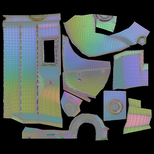
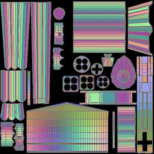
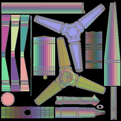
nerfy: yeah i like people to see just what goes into making these images, its a hell of a lot more work than it seems to the 'uneducated' for want of a better phrase. thanks man
the donal: got yer PM ill see what i can do when im done with what im aiming for. glowy eyes? hmm... ill look into it, see what it comes out like. thanks for the suggestion
stuuuuuuuuuuulla: haha thanks 'kin 'ell! thats a big sig picture!
CT: hehe thanks im really running short of different ways to thank people without sounding repetitive haha.
GoA: thanks for the kind comments means alot, i didnt notice at the time that this was the first postyou made after joining the forum, that means a lot also.
to answer you questions:
1. i started off with a sphere
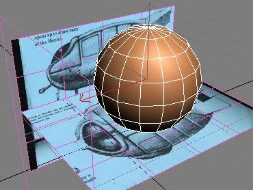
scaled it to fit the ref images i had
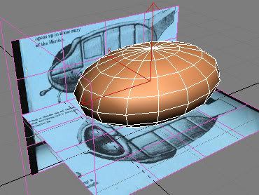
then remove the top and bottom faces so i had to rings of faces (the central, equatorial edge i used for the seam going around the fornt of the MFM body)
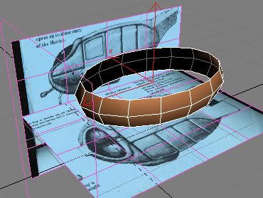
here is a link to the ref images i used, hopefully they will be a better resolution than your and will help you out.
www.thewaroftheworlds.com/messageboard/shwmessage.aspx?forumid=1&messageid=19832#bm19846
yeah those eye rims, hmm they bugged me for ages, if you look again at the first page, you see in the first couple of images they look simply GASTLY! and by the time i posted the textured eyes further down i had improved them a lot, but there was quite a bit of work in them, tricky little blighters the way i did them was to (and im speaking in 3ds max language now, oh hang on thats what you are using
  ) draw a spline object over the blank body then shapemerge it onto it so it cuts out the rough shape, i then inset the eye area, extruded the 'frame' and played about with it until the cows came home
regarding the legs, i believe they are a kind of 360° gimbal jointed thing when they get to the body but at the time (and for reasons of animation simplicity i opted to go for a ball joint, however wrong that may be)
and yeah obviouslythat scene was just to sort out the lighting, having a white scene lets you see the lighting more accuratey without the distraction of the different colour tones.
cheers for the interest mate
Right im back with a funky new avatar i made a few days ago
Sorry about this but im really advancing at an incredibly slow rate now im doing the environment, im now having to render this scene in three different files (foreground, mid ground and background) at its become far to heavy for my computer to take, standing at the moment at 1,200,000 tris unsmoothed (if you understand what i mean by that, if you dont then it means lots of detail for my measly computer to think about
heres yet another work in progress shot still with a lot of work ahead of me,
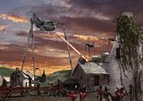
heres list of the main things to do on the scene still...
(this is for my benefit as an online 'to-do list' as much as showing you lot what i need to do)
1. The houses on the hill need doing, the house on hte far left need more bloody read weed climing over them, (that and the ivy is what takes up the main chunk of memory in the scene)
2. The lighting sucks (to coin an american phrase, too long i have been on my 3ds max forums with the yanks ) will need to improve that drastically to make this scene interesting as its pretty flat at the moment.
3. The road will be proper cobbles rather than the flat crappy texture it has now, again that takes a hell of a lot of memory to render and realy needs to be done on its own and composited as a different layer like the foreground .etc
4. There will be dust and debris coming out of the stamped on house as hes lifting his leg out (I say 'his' but suppose 'it' would be more apt really haha)
5. Also the cannon being rolled down the street will hopefully have dust kicked up behind it.
6. A gun and a cannon here and there will have just gone off so there will be some nice smoke effects there hopefully
7. The heat ray is a quick photoshop botch-up just so i could have something there as i didnt render that this time. but that will be the same as my previous post.
8. There will be a house light on here and there,
9. The grass around the edges wil be improved as its too light at the mo.
10. There will be some sort of scattered trees/forest/wood going on on the horizon to break that up a tad
11. A couple of falling green flamed cylinders wiil occupy the sky in the distance so thats not so empty
12.if im really in the mood i might make the parson holding up his cross to the MFM and a little easter egg for you WOTW nuts You may notice that there is a distinct lack of general public in the scene, and as its a lot of work to make people, i cant promise there will be any more. (id love to have women running about screaming and just a general state of panic, but i dont want to run out of steam on this image by biting off more than i can chew)
13. i will be varying the hair colour of the soldiers so they not so obviously clones.
14. may add a hint of a wisp of smoke coming from the house chimneys (im making this stuff up as i go here )
any more suggestions to the list will always be considered and appreciated.
any other comment are welcome of course.
cheers
p.s. WOW thats a lot of typing!
the donal: got yer PM
 ill see what i can do when im done with what im aiming for. glowy eyes? hmm... ill look into it, see what it comes out like. thanks for the suggestion
stuuuuuuuuuuulla: haha thanks
 'kin 'ell! thats a big sig picture!
CT: hehe thanks im really running short of different ways to thank people without sounding repetitive haha.
GoA: thanks for the kind comments means alot, i didnt notice at the time that this was the first postyou made after joining the forum, that means a lot also.
to answer you questions:
1. i started off with a sphere

scaled it to fit the ref images i had

then remove the top and bottom faces so i had to rings of faces (the central, equatorial edge i used for the seam going around the fornt of the MFM body)

here is a link to the ref images i used, hopefully they will be a better resolution than your and will help you out.
www.thewaroftheworlds.com/messageboard/shwmessage.aspx?forumid=1&messageid=19832#bm19846
yeah those eye rims, hmm they bugged me for ages, if you look again at the first page, you see in the first couple of images they look simply GASTLY! and by the time i posted the textured eyes further down i had improved them a lot, but there was quite a bit of work in them, tricky little blighters
 the way i did them was to (and im speaking in 3ds max language now, oh hang on thats what you are using
  ) draw a spline object over the blank body then shapemerge it onto it so it cuts out the rough shape, i then inset the eye area, extruded the 'frame' and played about with it until the cows came home
regarding the legs, i believe they are a kind of 360° gimbal jointed thing when they get to the body but at the time (and for reasons of animation simplicity i opted to go for a ball joint, however wrong that may be)
and yeah obviouslythat scene was just to sort out the lighting, having a white scene lets you see the lighting more accuratey without the distraction of the different colour tones.
cheers for the interest mate

Right im back with a funky new avatar i made a few days ago

Sorry about this but im really advancing at an incredibly slow rate now im doing the environment, im now having to render this scene in three different files (foreground, mid ground and background) at its become far to heavy for my computer to take, standing at the moment at 1,200,000 tris unsmoothed (if you understand what i mean by that, if you dont then it means lots of detail for my measly computer to think about
heres yet another work in progress shot still with a lot of work ahead of me,

heres list of the main things to do on the scene still...
(this is for my benefit as an online 'to-do list' as much as showing you lot what i need to do)
1. The houses on the hill need doing, the house on hte far left need more bloody read weed climing over them, (that and the ivy is what takes up the main chunk of memory in the scene)
2. The lighting sucks (to coin an american phrase, too long i have been on my 3ds max forums with the yanks ) will need to improve that drastically to make this scene interesting as its pretty flat at the moment.
3. The road will be proper cobbles rather than the flat crappy texture it has now, again that takes a hell of a lot of memory to render and realy needs to be done on its own and composited as a different layer like the foreground .etc
4. There will be dust and debris coming out of the stamped on house as hes lifting his leg out (I say 'his' but suppose 'it' would be more apt really haha)
5. Also the cannon being rolled down the street will hopefully have dust kicked up behind it.
6. A gun and a cannon here and there will have just gone off so there will be some nice smoke effects there hopefully
7. The heat ray is a quick photoshop botch-up just so i could have something there as i didnt render that this time. but that will be the same as my previous post.
8. There will be a house light on here and there,
9. The grass around the edges wil be improved as its too light at the mo.
10. There will be some sort of scattered trees/forest/wood going on on the horizon to break that up a tad
11. A couple of falling green flamed cylinders wiil occupy the sky in the distance so thats not so empty
12.if im really in the mood i might make the parson holding up his cross to the MFM and a little easter egg for you WOTW nuts You may notice that there is a distinct lack of general public in the scene, and as its a lot of work to make people, i cant promise there will be any more. (id love to have women running about screaming and just a general state of panic, but i dont want to run out of steam on this image by biting off more than i can chew)
13. i will be varying the hair colour of the soldiers so they not so obviously clones.
14. may add a hint of a wisp of smoke coming from the house chimneys (im making this stuff up as i go here )
any more suggestions to the list will always be considered and appreciated.
any other comment are welcome of course.
cheers
p.s. WOW thats a lot of typing!







 so i'm just redoing the model, it's going slowly though, I had to scrap my first few attempts.
 Prepare For The Future
