|
|
Post by Relyt on Oct 27, 2009 19:20:27 GMT 1
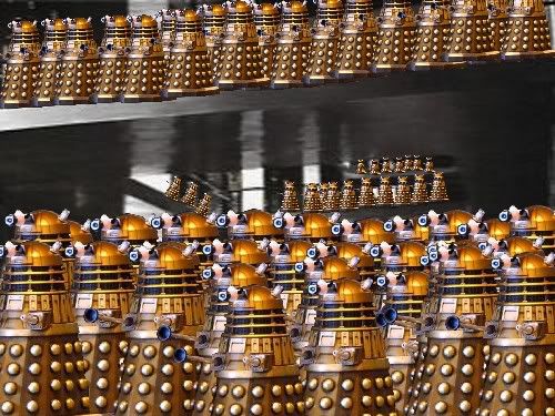
Accurate enough for me. Where I come from, people who have even heard the word Dalek are one in a million. Mind you, that is not an exaggeration.
|
|
|
|
Post by Commandingtripod on Dec 2, 2009 13:01:38 GMT 1
Well I've tried something else now. This one is shows Dalek Marines forming up in a saucer hanger. However I'm not terribly happy with the lighting, though I spent an hour or more tweaking it before deciding I had to find something I liked or else I'd keep on changing it. Anyway here it is. 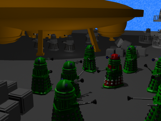 |
|
|
|
Post by Lonesome Crow on Dec 3, 2009 22:55:06 GMT 1
It's looking good, but I see what you mean about the lighting.
Have you tried adding or increasing the ambient lighting?
If you can darken the shadows under the ship while brightening the Daleks in the foreground I think it will increase the depth of field.
|
|
|
|
Post by Commandingtripod on Dec 4, 2009 5:13:30 GMT 1
Is this what you had in mind? I think it's looking a lot better actually. 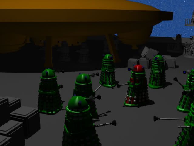 |
|
|
|
Post by Lonesome Crow on Dec 4, 2009 22:21:02 GMT 1
Yes it's certainly looking better.
Before, the saucer's underside was the same depth of light and shadow as the upper side this made the saucer look flat like a cardboard cut-out. Now you need some hard highlights on the top of the saucer, like the highlights you have on the top of the Dalek's turrets.
Are you using just one light source to illuminate the whole scene? if you are I would suggest adding some directional lights or spotlights shining on the group of Daleks in the foreground, you need to make them stand out more, they are the main focal point of the picture.
|
|
|
|
Post by Commandingtripod on Dec 10, 2009 6:05:31 GMT 1
How's this one now? 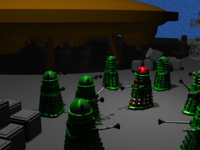 I think it looks even better. |
|
|
|
Post by mrgrotey on Dec 10, 2009 9:54:17 GMT 1
Right im going to be honest here becuase you dont learn from 'wow its awesomorz!!11!1 comments.
Your lighting needs a huge overhaul. But at the same time so do the materials. The lighting gives the appearance of an interior lightbulb not a far off sun/moon lit scene. It is very apparent that your light source is directly above the darlek on the left. Look at the shadows on him then look at the shadows on the far right one. they are completely different. the sun is so far away that a directlight (parallel) rather that an omni or spotlight will serve you much much better.
Your materials look more like standard object colours than proper materials and that is letting the image down a lot, especially in the case of the spaceship. They do not tell us what the objects are made of and thats 99% of their job.
If all you are doing is sorting the lighting out rather than trying to texture it then light the scene with flat white materials for everything then you will not be distracted by the different colours.
Look up some moonlit/sunlit images on google to see what colour tone you need to be going for. I say moonlit/sunlit as at the moment I have no clue what lighting you are going for. You background sky image suggests stars coming out at the end of the day/evening but your harsh shadows and position of the lightsource suggest midday afternoon light.
You dont seem to have any ambient occlusion happeneing which is a big part fo realism. If you dont know what that is then wikipedia will tell you.
Realism is helped greatly by having the camera at the height of a human pair of eyes i.e. place the camera at 6feet off the ground not 18feet as we wopuld never see the scene from that height.
Scale is another thing that should be looked into more. There is nothing in the scene to give the viewer a sense of how large things are. The closest thingyou have got to that are the boxes/crates but they could be any size at all. Add something that well all know that wont be out of place in the scene.
Hope this helps
|
|
|
|
Post by Commandingtripod on Dec 10, 2009 13:29:53 GMT 1
Your criticisms are welcome MrGrotey, I'd learn nothing if everyone told me it looked awesome. For the record, the lighting is meant to look like this because it's on the inside of a ships hanger, not outside. Having said that though, the lighting could be improved certainly. The stars look like that because they have a blue filter applied over it that is meant to be a "shield", the shield effect is most evident in post 16 where it was at 100% opacity, however I decided to add stars behind it because it look weird, because there was nothing there. Regardless, texturing is a big problem, and always has been. I confess, I've never been any good at texturing, however now that the battle to build the Dalek is over, I suppose I can take up a new battle and try and texture it. Either way, I've decided to scrap that scene, I'll try again eventually however I want to learn more first before attempting it again. In the mean time, I have made this. 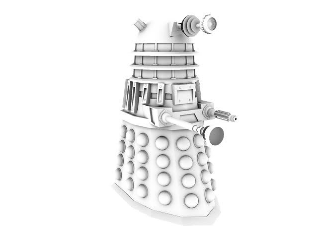 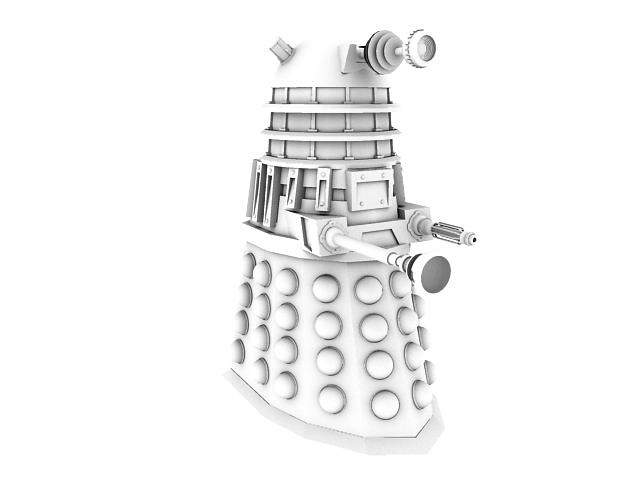 Hm...I'll admit it, it looked better in MAYA. Now the main problem is getting it textured right. |
|
|
|
Post by Lonesome Crow on Dec 10, 2009 22:54:54 GMT 1
Yes that scene does look better, but it's still not there. I knew it was inside the hanger from your opening statement, so sun or moon light would not be appropriate but nor is only one light source appropriate, In a hanger that big you would need at least 10 or 12 lights, spread out over the whole area and you could actually make the lights a part of the scene, put some on the walls. And I feel you still need a bright highlight reflecting off the top of the saucer. Mr G is right about your viewpoint, looking down on the Daleks does give a good idea of a large space but it diminishes the overall threat of these powerful beings. they tend to look like ants you could squash with your thumb. It's a shame you're giving up with it. come back to it when you've improved your texturing skills. And one other thing from your early Dalek model, the hemispherical cups on the lower part of the body (I believe they are bombs), the highlights go in different directions and this looks wrong, you probably noticed this yourself as the highlights have changed in your later pictures. 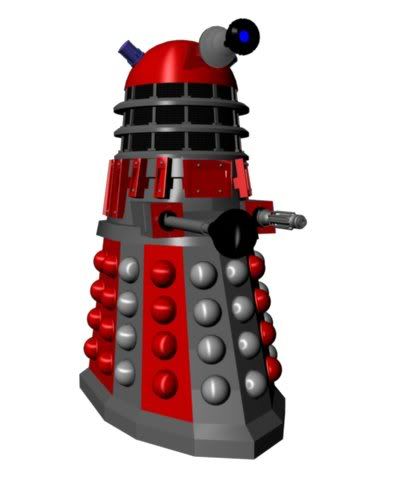 |
|
|
|
Post by Commandingtripod on Dec 11, 2009 1:04:54 GMT 1
Cheers LC, well I have the basis of the scene now, but when I finally get my Dalek textured and looking good enough, it would be a pain to try and retexture all of the Daleks, it would just be easier to insert them in again later on.
I was beginning to think I needed to add more lighting in to, I was thinking of duplicating the main light (above the Marines) several times over and spacing them out. I also adjusted the camera by lowering it down and it looked much better.
Additionally, you're right I did spot that problem with the hemispheres (that's what we call them) after I rendered and posted that. The solution was to change the type of material, from Anisotropic to Blinn which as you can tell from the above saucer hanger shots, which makes the highlights more even.
|
|
|
|
Post by Commandingtripod on Feb 26, 2010 10:57:28 GMT 1
Well quite a bit of time has passed since I last posted in here. Anyway, I went off and did some more work on my ships, but I also continued work on my Dalek. Here is how it looks currently.  I'm attempting some motion tracking at the moment with my Daleks, but it's not coming along terribly well.  |
|
|
|
Post by Lonesome Crow on Feb 26, 2010 21:36:03 GMT 1
Looking good, I like the reflections on the surface of the spheres.
You can see the sink-plunger reflected as well as the egg-whisk. ;D
|
|
|
|
Post by Commandingtripod on Apr 11, 2010 15:49:24 GMT 1
I thought you guys might be interested in this.
It was done in the course of one day. Of course, there is more than needs to happen, like the Daleks need shadows and to be correctly lit and all. However that wasn't the purpose of it, the purpose was to practice motion tracking further and get an idea of how it will look.
Overall, I'm pretty pleased with the way it came out, given the bumps and shakes of the camera, the Daleks are placed in reasonably well.
|
|
|
|
Post by Lonesome Crow on Apr 11, 2010 16:17:02 GMT 1
Very good! despite the camera-shake the Daleks stay in their relative positions. Well done.  |
|
|
|
Post by richardburton on Apr 12, 2010 10:37:56 GMT 1
Nice work!
|
|