|
|
Post by Anim8tr on Apr 13, 2010 4:02:09 GMT 1
Good progress, mate!  |
|
|
|
Post by Commandingtripod on Apr 19, 2010 8:55:39 GMT 1
Here's the latest. 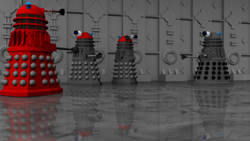 I've traditionally been terrible when it comes to backgrounds, I'm not sure why, but I can model a reasonable machine/creature but the background always seems to let it down. Anyway, I've decided to overcome that problem I need to split the background into individual sections. The corridor behind the Daleks was modeled as one individual pillar, but then I can duplicate it as many times as needed to create the corridor effect (as I have done). The floor was taken from another section I had made, part of a room. The above scene to was rendered using the default light, but I'll try and make a second version with more lights added and all that, to make it look just that little bit better. Hopefully it comes out looking nicely, I just need to practice. Here's the pillar: 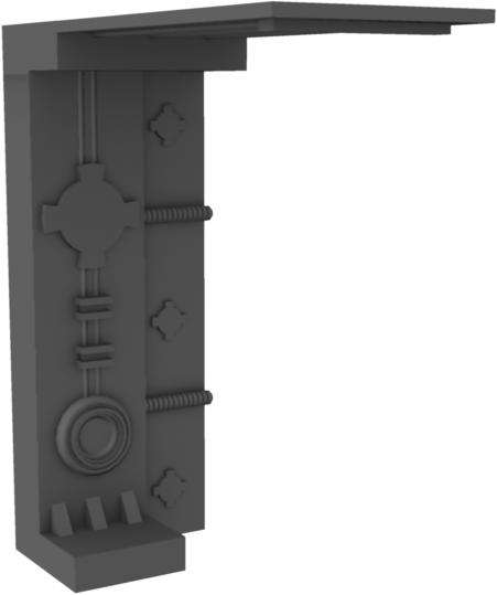 And here's the room (or at least part of it): 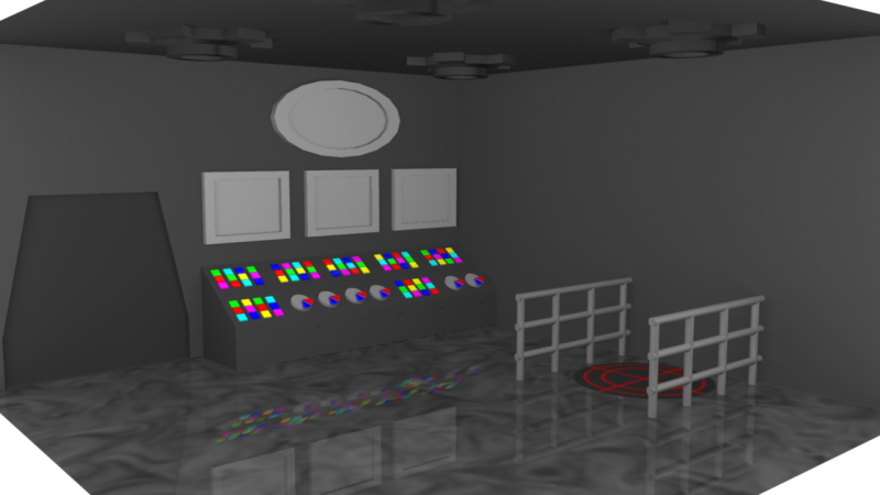 |
|
|
|
Post by Lonesome Crow on Apr 19, 2010 22:46:20 GMT 1
Nice! I like the background and it should look better when you've added some more directional lights. Looking good.  |
|
|
|
Post by Anim8tr on Apr 22, 2010 2:04:19 GMT 1
I like how you replicated the pillars, to create your background/wall. It looks really good and adds a lot of detail. Nice perspective and good depth. The reflections casted on floor/groundlayer really caught my eye as well! Good looking render, CT.! Now tweak her mate! I'd love to see just a bit more 'weathering' here and there.  |
|
|
|
Post by Relyt on Apr 22, 2010 2:30:08 GMT 1
Is the Dalek in the middle saying "Sieg heil?"
|
|
|
|
Post by Commandingtripod on Apr 23, 2010 14:30:44 GMT 1
Thanks LC.  I like how you replicated the pillars, to create your background/wall. It looks really good and adds a lot of detail. Nice perspective and good depth. The reflections casted on floor/groundlayer really caught my eye as well! Good looking render, CT.! Now tweak her mate! I'd love to see just a bit more 'weathering' here and there.  I'll have to work on getting the Daleks looking more weathered, I'm unsure which material to use, but I'm thinking of a Blinn with its reflectivity and shininess cranked down to nearly nothing. Cheers!  Is the Dalek in the middle saying "Sieg heil?" Pretty much yes, there was a scene from the Dalek invasion of Earth where the Daleks infront of Nelson's monument gave a quite pronounced nazi-style salute with their plungers. It's a scene I've remembered and I use it every now and then. |
|
|
|
Post by Relyt on Apr 23, 2010 19:35:32 GMT 1
Well that was unexpected. I was only half-kidding when I mentioned the Nazi salute.
Now I know that Nelson is entombed in the depths of St. Paul's Cathedral (I visited his grave 10 years ago), but I'm not familiar with the monument you mentioned. Are we both speaking of his grave?
|
|
|
|
Post by Lonesome Crow on Apr 23, 2010 22:01:39 GMT 1
Now I know that Nelson is entombed in the depths of St. Paul's Cathedral (I visited his grave 10 years ago), but I'm not familiar with the monument you mentioned. Are we both speaking of his grave? I'm presuming CT was referring to Nelson's Column in Trafalgar Square, London.  here is the image CT mentioned:  |
|
|
|
Post by Commandingtripod on Apr 24, 2010 5:19:57 GMT 1
That was it, I went looking for that image but couldn't find it myself. Cheers LC!
|
|
|
|
Post by Lonesome Crow on Apr 24, 2010 23:37:55 GMT 1
Just Googled 'Trafalgar Square Dalek' and there it was.  |
|
|
|
Post by Commandingtripod on Apr 25, 2010 15:00:09 GMT 1
I didn't even think of searching that! And I spent quite a bit of time searching for it and finding nothing!  Related to Daleks, I've recreated my Dalek Saucer, it looks much more imposing (and less of a joke) than the older one did. 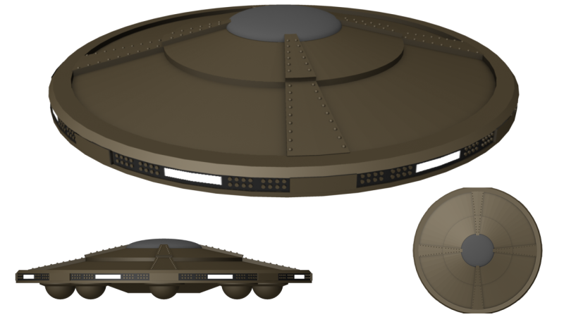 Personally, I very much like its profile from side on. |
|
|
|
Post by Lonesome Crow on Apr 25, 2010 17:05:07 GMT 1
Does indeed look good, Nice one  |
|
|
|
Post by Commandingtripod on May 12, 2010 8:09:25 GMT 1
Thank you LC.  Right then, everything is ready. Here's a new render of 5 Daleks together. 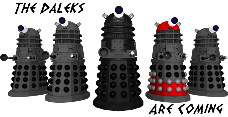 As you can see, I've redone the Dome lights, and now they actually have lights in them. You can see the difference with the render at the top of the page. The next two renders show the difference in brightness in the light. How bright it ends up as depends on the background and all. 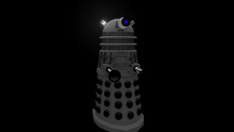 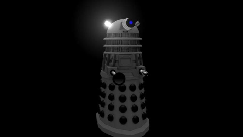 I have also changed the Dome itself, adding more groves and detail. It looks 'chunkier' (I suppose that's how you'd describe it) compared with the older smoother one, and fits better into the style of the NSD. 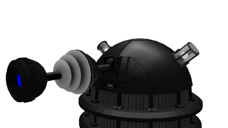 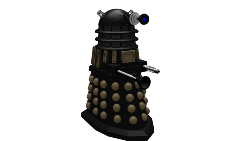 |
|
|
|
Post by Lonesome Crow on May 13, 2010 1:20:20 GMT 1
I quite like the your new design, at first I though the eye stork was too big, but it only looks big compared to the size of the dome, when you see the whole Darlek it looks right. I like the colour scheme also. Nice one.  |
|
|
|
Post by Luperis on Jun 8, 2010 16:03:11 GMT 1
Very nice. I really like how your Daleks and the Dalek saucer have developed. ^^ About the saucer: The shape, design and detailing are great. I can see its come a long way from the original design, and does look a lot more imposing and dangerous... but I'd love to see a little weathering and/or texturing to the metal (maybe a few dents and scratches - but these are not necissary, as I'm sure the Daleks would fix up their ships quite regularly) to give it that 'used' look.... make it look like it's been flying through space for a long time and taken part in battles, rather than looking like a new display model that a Dalek car salesman would show other Daleks at a flying saucer dealership. I don't know if this is this possible using the program you have, but if it is, it might be worth having a try as it would cretainly add some extra depth to the image.  About the Daleks: About the Daleks: I really like the colour schemes you are using for them, especially the ones with red highlights; and your new black and gold one. Very cool.  Overall, though, your work is looking super. Keep up the great work, and I look forward to seeing more! |
|